Automated Data Analytics on AWS
Visualize your cloud data workflows with the Automated Data Analysis on AWS example.
 Architecture Diagrams
  Diagram-as-code
  AWS
AWS About this example
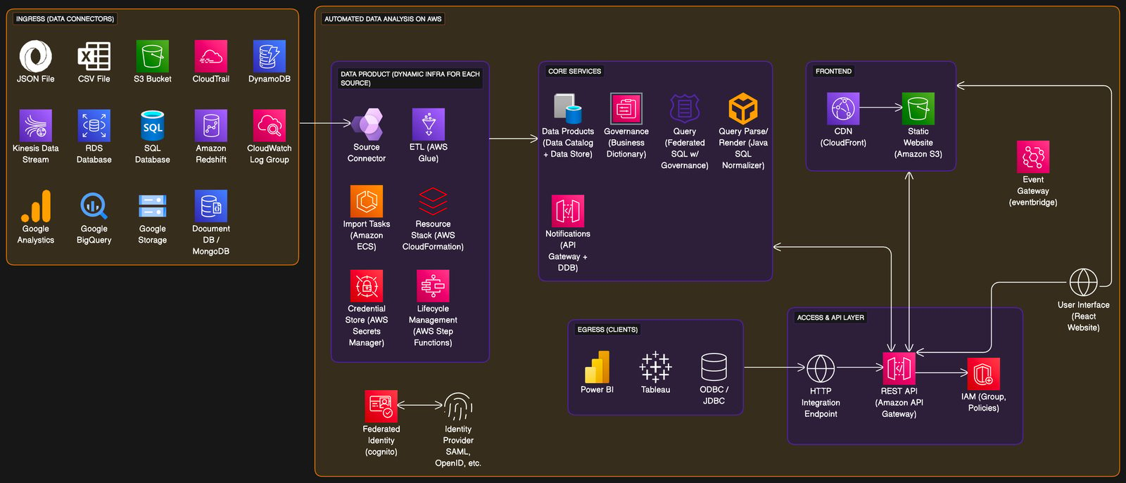
AWS is central to modern cloud architectures, and this example provides a comprehensive overview of a robust data analysis setup. Here’s a breakdown of the example:
- Ingress (Data Connectors): Shows various data sources like JSON and CSV files, AWS services (S3, DynamoDB), and Google services (Analytics, BigQuery).
- Automated Data Analysis on AWS: Details the process flow from source connectors through ETL (AWS Glue) to data product creation.
- Core Services: Outlines governance, query services, and notification mechanisms required for a secure and efficient data analysis environment.
- Frontend and Egress: Illustrates how data is presented to end-users via tools like Power BI, and how it interacts with front-end services like static websites and APIs.
When to use
- Data Workflow Design: When structuring a cloud-based data pipeline that requires coordination of various AWS services and external data sources.
- Compliance and Governance: When your team needs to understand and implement data governance and compliance within AWS.
- Educational Resource: When onboarding new team members to the AWS ecosystem, this diagram can serve as a visual aid for understanding the data flow and services involved.
How to use
- Start editing: Duplicate example file and double-click on the diagram.
- Customize diagram: Add / modify nodes, groups, relationships using your chosen diagram-as-code syntax. Use icons where possible to make the diagram more intuitive.
- Customize layout: Drag elements on the diagram directly on the canvas to manipulate the layout.
- Collect feedback: Share the file with collaborators and encourage them to use the comments feature for feedback.
Related Examples
View all examples →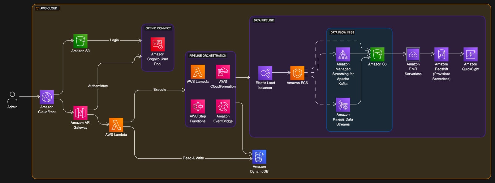
Clickstream Analytics on AWS
Streamline your data analysis by visualizing clickstream workflows with the Clickstream Analytics on AWS example.
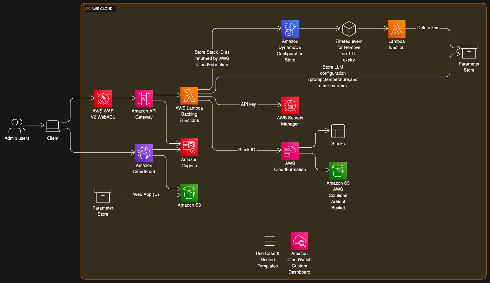
Generative AI Application Builder on AWS
Visualize your AI-driven application infrastructure with the Generative AI Application Builder on AWS example.
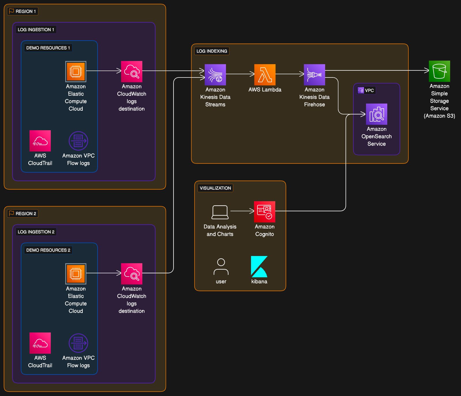
Centralized Logging on AWS
Visualize complex logging workflows with the centralized logging example.
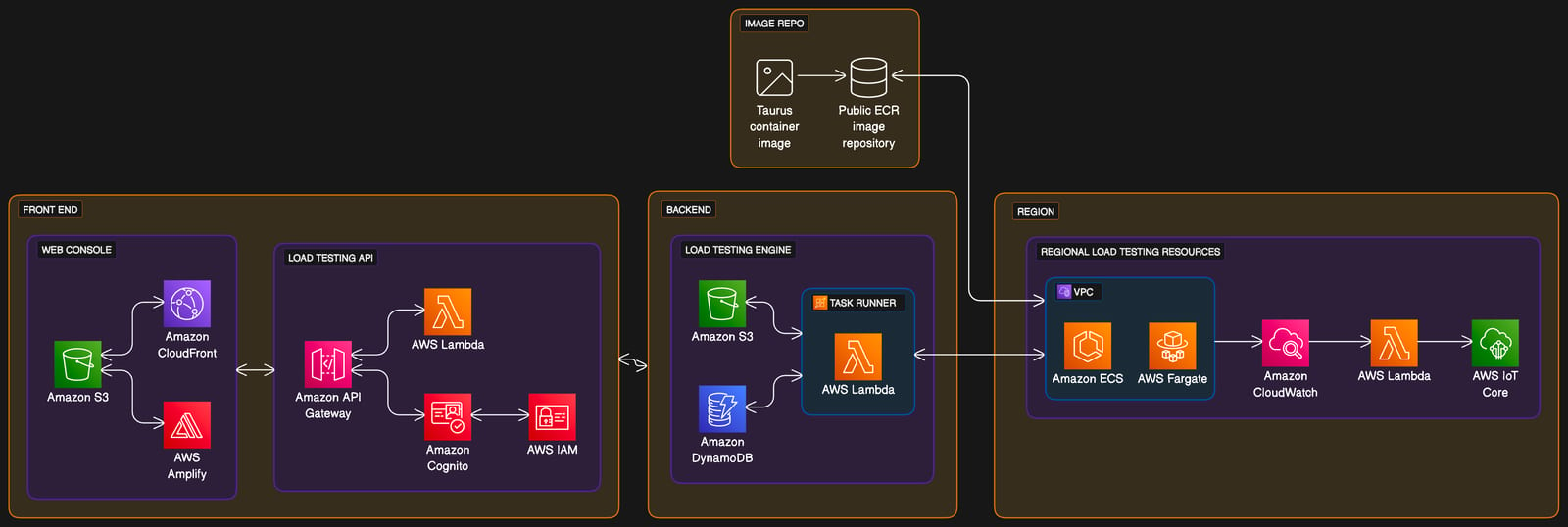
Distributed Load Testing on AWS
Visualize your scalable load testing architecture with the Distributed Load Testing on AWS example.
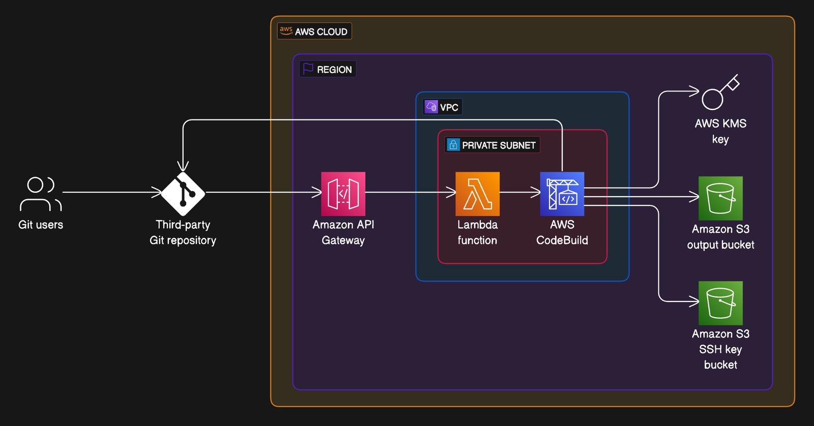
Git to S3 using Webhooks
Visualize your code deployment workflow from Git to S3 using Webhooks with this AWS infrastructure example.
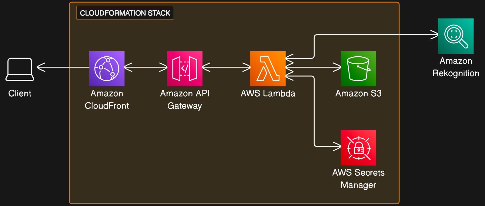
Serverless Image Handler on AWS
Visualize your image processing architecture with the Serverless Image Handler on AWS example.
See you in the canvas
Unlock your team’s collaborative super powers.