Diagram types
Wireframe
A wireframe is a low-detail sketch of a screen that shows its layout, content and controls as plain boxes and lines, before any visual design is applied.
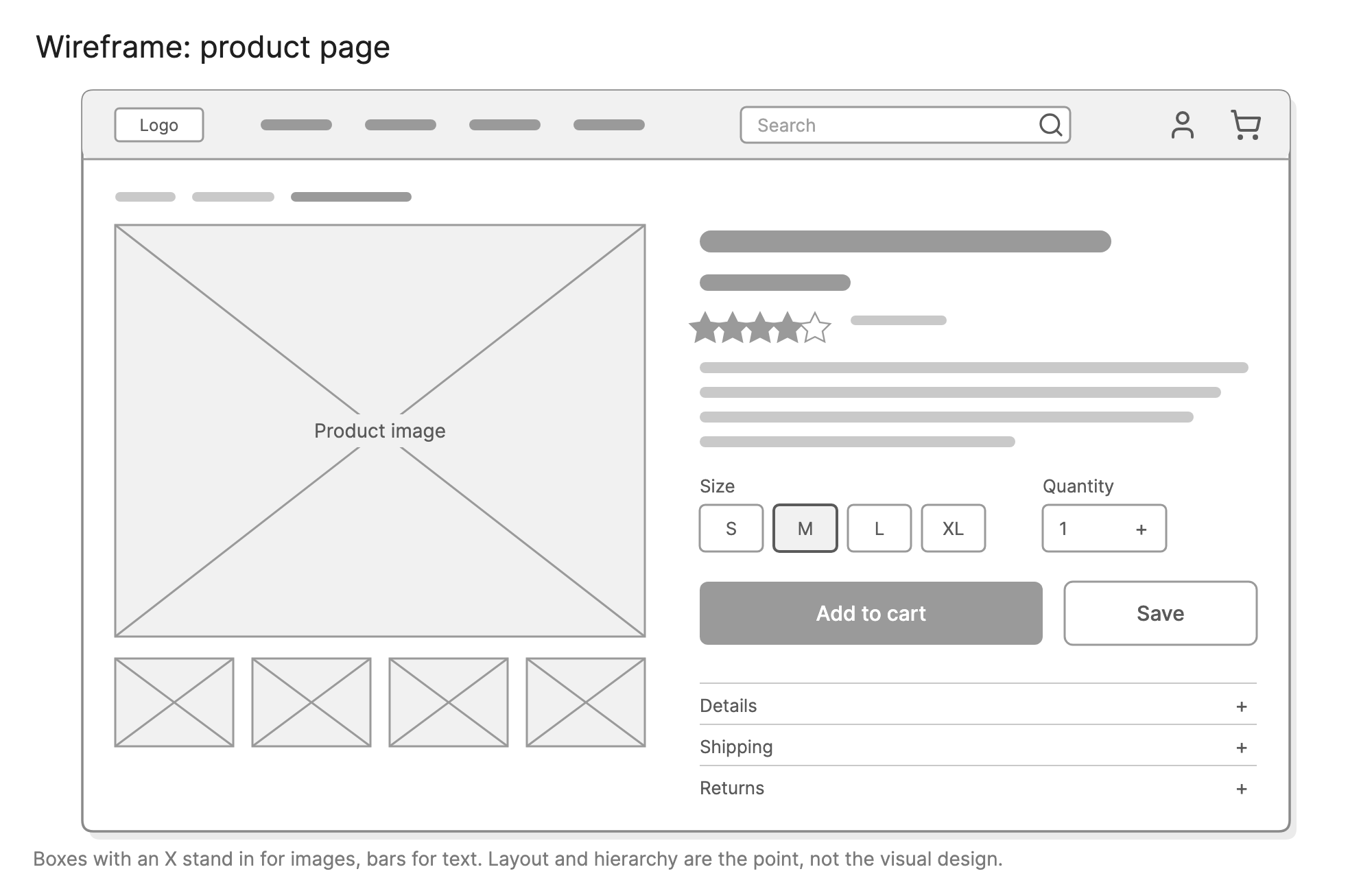
Teams wireframe a screen to agree on what goes on it and how it is arranged before spending time on visual design or code. Because a wireframe is deliberately rough, people argue about the layout rather than the colors, and it is cheap to throw away.
When should you use a wireframe?
- Planning a new screen. Decide what content and controls it needs, and their priority, before anyone opens a design tool.
- Writing a spec or a ticket. A wireframe beside the text removes most questions about what “a filter panel” means.
- Testing an idea with users. Rough screens get honest feedback about the structure, because nobody mistakes them for the finished product.
- Comparing layouts. Drawing two or three wireframes of the same screen is the fastest way to choose between them.
- Checking a flow. Lay the wireframes out in order to see whether a user flow makes sense screen by screen.
What are the parts of a wireframe?
Wireframes use a small set of conventions that most people recognize without a legend.
- Containers. Rectangles for the page, the nav bar, cards and panels. Their size and position show hierarchy.
- Image placeholders. A box with an X through it marks where an image, video or illustration will go.
- Text. Horizontal bars for body copy, with thicker or darker bars for headings. Real words where the wording matters.
- Controls. Buttons, inputs, dropdowns, checkboxes and links, drawn as plain outlines and labeled with what they do.
- Navigation. The nav bar, tabs, breadcrumbs and footer links, so the screen’s place in the product is clear.
- Annotations. Numbered notes that explain behavior the picture cannot show, such as what happens when a list is empty.
Everything is gray on purpose, so the only thing a reader can react to is the layout.
What are the types of wireframe?
Wireframes are described by fidelity, which is how close they are to the finished screen.
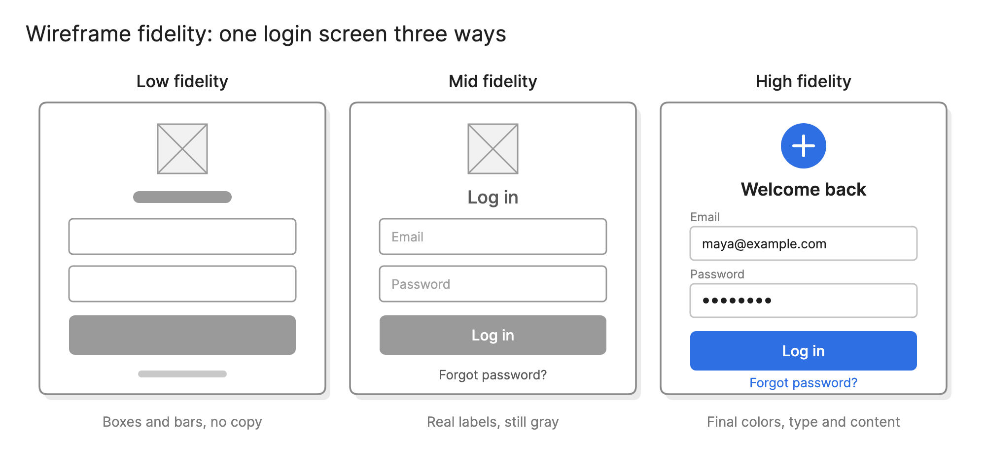
| Fidelity | What it includes | Good for |
|---|---|---|
| Low | Boxes, bars and placeholders, often drawn by hand | Exploring layouts and getting early feedback |
| Mid | Real labels and text, accurate proportions, still gray | Specs, reviews and usability tests |
| High | Final copy, colors, type and imagery | Sign-off and handoff to engineering |
High-fidelity wireframes are usually called mockups. Stay low for as long as the layout is still changing, and add detail only when it answers a question someone is asking.
How do you read a wireframe?
Start with the biggest shapes. In the product page example, the image placeholder takes the left half and the product details take the right, so the page is built around the photo. Then read the right column from top to bottom: the dark bar is the title, the shorter bar below it is the price, and the stars and bars are the rating and description.
Below the description, the size and quantity controls sit directly above the add to cart button, which is the darkest shape on the page. That is the point of the layout: the path from choosing a size to buying is short and unbroken. The accordion rows at the bottom hold details most buyers do not need, so they are collapsed.
Reading it this way makes the design decisions visible. Should the reviews be higher? Does the save button need to be as big as the buy button?
How do you create a wireframe?
- Know the goal of the screen. Write down what a user comes here to do and what the business needs them to see.
- List the content. Every heading, image, field, button and message the screen needs, in priority order.
- Sketch the layout. Place the highest-priority content first. Keep it rough, and draw two or three options if you are unsure.
- Add real labels. Put actual words on buttons, headings and navigation, because they change the layout.
- Annotate behavior. Note states the picture cannot show: loading, empty, errors and what each button does.
- Review it against the flow. Put the wireframe next to the screens before and after it and check that the path still makes sense.
What are common wireframe mistakes?
- Too much polish, too early. A wireframe that looks finished gets feedback about colors and fonts instead of structure.
- Ignoring real content. A layout that works with three short placeholder bars often breaks with a real product name.
- Forgetting states. Empty lists, long names, errors and loading all need a wireframe or a note.
- One wireframe for every screen size. Decide early whether you are wireframing desktop, mobile or both. The layouts differ.
- No annotations. Behavior that is obvious to the person who drew the screen is not obvious to the engineer building it.
How does a wireframe compare with other diagrams?
| Diagram | What it shows | Use it to answer |
|---|---|---|
| Wireframe | The layout of one screen | What goes on this screen, and where? |
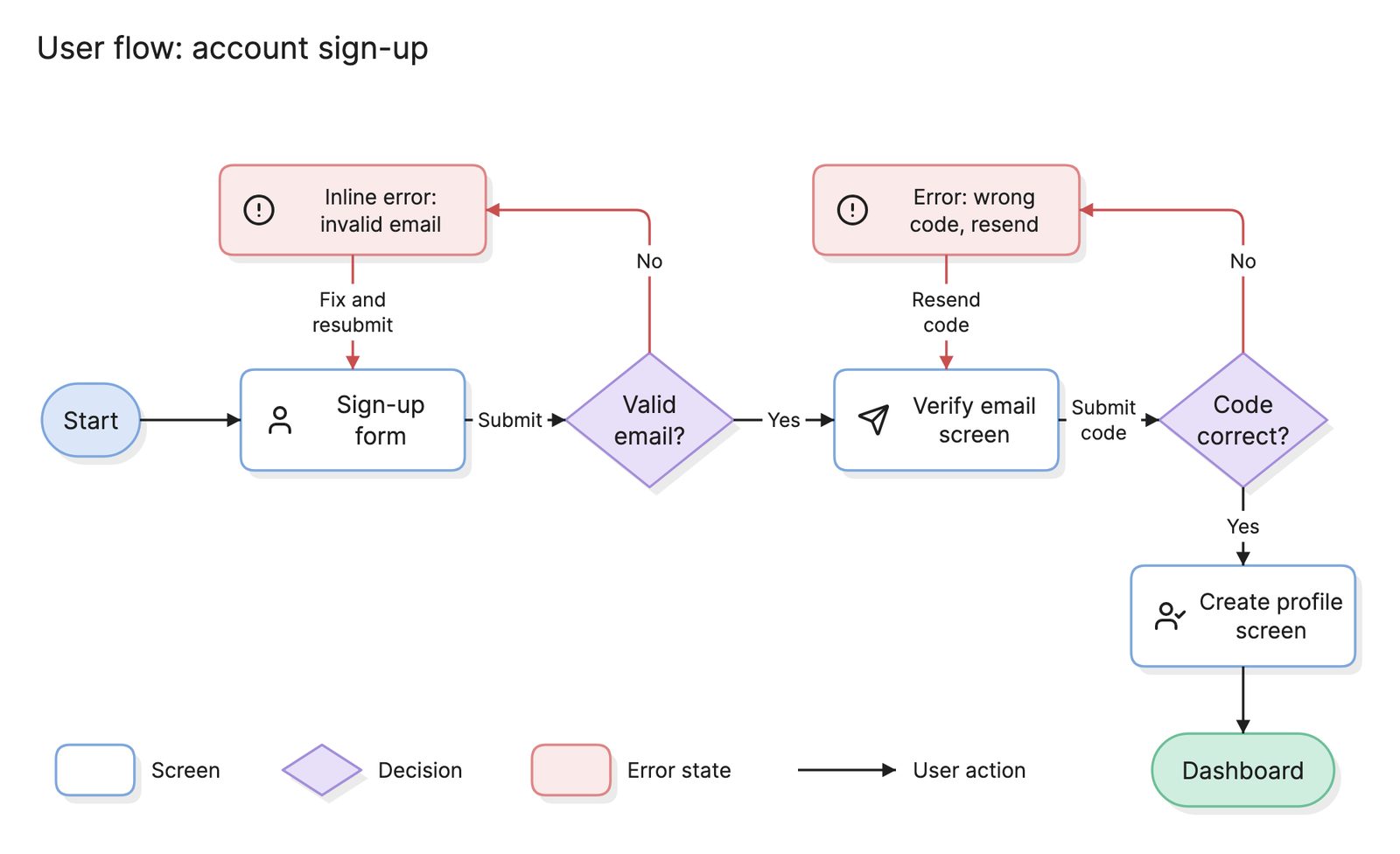
| User flow | The sequence of screens and decisions in one task | What steps does a user take to do this? |
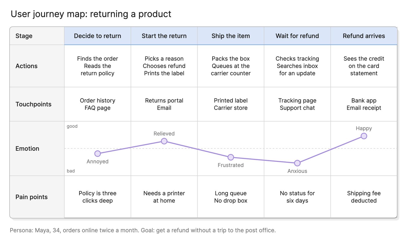
| User journey map | A user’s experience over time, inside and outside the product | Where is the experience good or bad? |
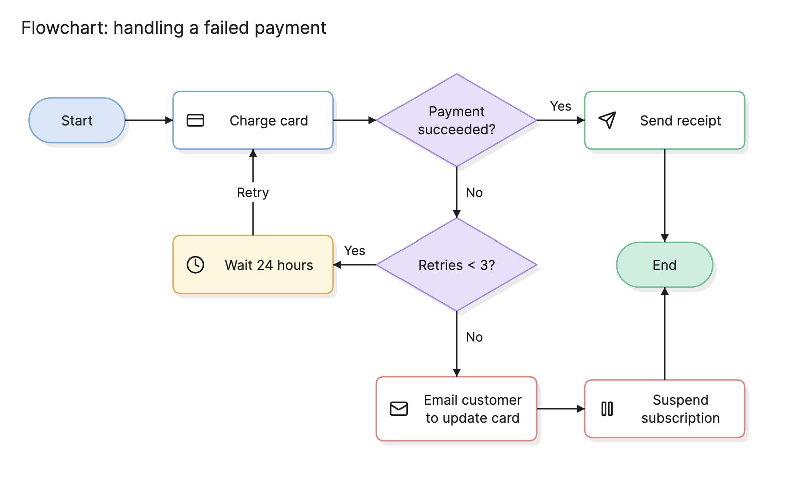
| Flowchart | The steps and decisions in any process | How does this process run? |
What tools can you use to make a wireframe?
The best tool is the one that keeps the wireframe rough enough to change.
- Paper and a marker. The fastest way to compare layouts, and impossible to over-polish.
- Design tools. Good once the layout is settled, since the wireframe can grow into the mockup. The risk is adding detail too early.
- AI diagramming tools. Tools like Eraser draw a wireframe from a written description of a screen, which suits teams that already have the content listed in a spec, and keep it on the same canvas as the user flow it belongs to.
For more on this kind of diagram, see wireframes.
Frequently asked questions
-
What is the difference between a wireframe and a mockup?
A wireframe shows structure: what is on the screen and where. A mockup adds the visual design, including color, type, spacing and imagery, so it looks like the finished product. Mockups take longer to make and change, so teams settle the wireframe first.
-
What is the difference between a wireframe and a prototype?
A wireframe is a static picture of one screen. A prototype links screens together so someone can click through them, at any level of fidelity. A set of wireframes connected into a prototype is a common way to test a user flow before building it.
-
Should wireframes use real text?
Use real headings, labels and button text as soon as you know them, because they affect layout and they are what users read. Placeholder bars are fine for body copy you do not have yet. Avoid lorem ipsum in places where the words matter, such as error messages and calls to action.
-
Who makes wireframes?
Anyone who needs to explain a screen. Designers make most of them, but product managers sketch wireframes to describe a feature, and engineers draw them to think through a settings page or an admin tool. Since a wireframe is meant to be rough, the tool and the drawing skill barely matter.